
What I learned debugging a factory at 5 AM

The call came at 5:14 AM. A bearing on production line 7 had failed, and the plant manager wanted to know why our "predictive maintenance system" hadn't caught it. I spent the next four hours tracing data from the dashboard back through our pipelines, and what I found changed how I think about industrial data architecture.
The sensor had actually detected the anomaly. The temperature readings showed a clear upward trend starting six hours before the failure. But somewhere between the raw sensor data and the predictive model, we'd lost the signal. A validation rule, one I'd written myself trying to be clever about filtering outliers, had flagged the rising temperatures as "implausible" and excluded them from the clean dataset. The model never saw the warning signs because I'd accidentally taught the system to ignore them.
That night taught me something no architecture diagram ever could: in manufacturing, the cost of being too aggressive with data cleaning is measured in broken machinery and production downtime. And it completely reshaped how I approach industrial IoT pipelines.
SCADA Data is different from everything else

Let me tell you about SCADA data, because until you've worked with it, you don't really understand why factory floor data is different from everything else in the data engineering world.
SCADA systems were designed in an era when storage was expensive and networks were unreliable. They compress aggressively, they batch opportunistically, and they have their own ideas about what timestamps mean. I once spent two weeks debugging a data quality issue that turned out to be a SCADA system reporting timestamps in local time during winter and UTC during summer — not because of daylight saving time, but because someone had configured it that way a decade ago and nobody remembered why.

The instinct when you first encounter this is to normalize everything immediately. Parse the timestamps, convert to UTC, standardize the schemas. Get it into a clean format as fast as possible so you can work with it like normal data. This instinct is wrong, and it took me years to understand why.
The problem is that normalization destroys information. When you convert that quirky timestamp to UTC, you lose the ability to debug timestamp-related issues. When you parse a numeric value from a string, you can no longer see that the source was sending "23.5°C" with a unit suffix that your parser silently dropped. When you unify SCADA data and PLC data into a single table because "they're both sensor readings," you lose the ability to reason about their different reliability characteristics.
I now keep SCADA and PLC data completely separate all the way through ingestion. They land in different tables, with different schemas, preserving all the quirks of their respective sources. When something goes wrong, I can look at exactly what each system sent, in exactly the format it was sent, without wondering whether my transformation logic introduced the bug.
This might sound obvious, but I've reviewed dozens of industrial data architectures, and at least half of them try to unify everything too early. "But it's more efficient!" they say. "We don't want to maintain multiple pipelines!" And then they spend weeks debugging issues that would have been obvious if they could just see what the source systems actually sent.
Flag, Don't Filter
The real art in industrial data isn't ingestion. It's knowing when to validate and when to preserve.
Here's the tension: sensors lie. They drift out of calibration, they malfunction, they send garbage when there's electrical interference. You absolutely need validation logic to catch these issues. But sensors also tell the truth in ways that look like lies. A temperature spike that seems "implausible" might be the first sign of a bearing failure. A pressure reading outside normal ranges might indicate a process change that operations made without telling anyone.
The validation rule that bit me at 5 AM was checking whether temperature readings fell within two standard deviations of the rolling average. Statistically sound, right? The problem is that equipment failure doesn't follow normal distributions. It starts with small anomalies that grow over time, exactly the kind of gradual deviation that a rolling-average filter is designed to smooth out.
I've since moved to a different approach: flag, don't filter. When a reading looks suspicious, I add a warning flag and a severity level, but I keep the data. The downstream models can decide whether to include or exclude flagged readings based on their specific use case. Real-time alerting might want to include everything and tolerate some false positives. Historical analysis for predictive maintenance definitely wants the "anomalous" readings — those are often the most valuable.
The implementation is simple but the discipline is hard. Every time I write validation logic, I ask myself: "If this rule had existed last month, what real events would it have filtered out?" Usually I don't know the answer, which is exactly why I shouldn't be dropping data.

Anomaly detection needs context
Let's talk about where anomaly detection actually belongs, because I see this done wrong constantly.
The temptation is to put anomaly detection as early as possible in the pipeline. "We want to alert quickly! We need low latency!" So teams run anomaly detection on raw sensor streams, or on lightly cleaned data, and they wonder why the false positive rate is so high.
The problem is context. A temperature reading of 85°C from a sensor on machine 12 is completely normal during one shift and a critical warning during another. A pressure spike in isolation might be noise, but a pressure spike correlated with a temperature drop across multiple sensors is a clear pattern. Anomaly detection without context is just noise detection.
In my current architecture, anomaly detection happens after dimensional enrichment. By the time the model runs, each sensor reading has been joined with factory metadata, shift information, machine operating mode, and historical baselines for that specific machine under those specific conditions. The model isn't asking "is this reading unusual?" It's asking "is this reading unusual for this machine, during this shift, given what we know about normal operation?"
This requires more data movement and more compute. It adds latency. But the alternative is an alerting system that cries wolf so often that operators learn to ignore it. I'd rather have accurate alerts that arrive 30 seconds later than instant alerts that nobody trusts.
The one exception is obvious threshold violations. If a temperature sensor reads 500°C when the physical maximum for that sensor is 200°C, you don't need a sophisticated model to know something is wrong. Those checks happen early, flagged as data quality issues rather than operational anomalies. But the subtle stuff, the gradual degradation, the unusual patterns, the early warning signs, that needs the full context of enriched data.
Operations and Maintenance need different views
Something I wish someone had told me when I started building industrial dashboards: operations teams and maintenance teams need completely different views of the same data.
Operations wants to know what's happening right now. They need a dashboard that refreshes every minute or two, shows current status at a glance, and highlights any machine that needs immediate attention. The design principle is minimize cognitive load. A quick glance should tell them whether to worry.
Maintenance wants to know what's going to happen. They need historical trends, degradation curves, predictions about when components will need replacement. They don't care about minute-by-minute updates; they care about weekly and monthly patterns. The design principle is maximize insight. Give them the data to make proactive decisions.
I used to try to build one dashboard that served both. It was a disaster. Operations found it too cluttered with historical charts they didn't need. Maintenance found it too focused on real-time metrics that weren't useful for planning. Both teams complained that they couldn't find what they needed.
Now I build separate consumption endpoints, each optimized for its specific use case. The production dashboard is wide tables, pre-aggregated, heavily cached, designed for fast reads. The predictive maintenance reports are deeper, more detailed, with drill-down capabilities and longer historical windows. They're fed by different aggregations of the same underlying data, but they're shaped completely differently.

The third consumption pattern I've learned to build explicitly is real-time alerting. This isn't a dashboard. It's a feed that goes directly into the plant's notification systems. When an anomaly flag goes true on a critical machine, operators get a push notification immediately. This has different requirements than either dashboard: it needs lower latency, higher reliability, and much stricter filtering to avoid alert fatigue.
Three consumption patterns, three different designs, one underlying data platform. Trying to serve all three from a single "gold table" is how you end up with something that works poorly for everyone.
Simple Beats Clever
The most counterintuitive lesson I've learned about industrial data: simple transformations are almost always better than clever ones.
Early in my career, I was proud of my sophisticated data quality rules. Statistical outlier detection! Machine learning for anomaly classification! Automated schema inference! The pipelines were elegant and impressive in architecture reviews. They were also impossible to debug when they broke, which was often.
These days, my transformation logic is boring. Parse timestamps using explicit format strings. Cast numeric values with fallback to null on failure. Check range limits against hardcoded thresholds from equipment specifications. Flag records that fail validation instead of dropping them. Every transformation can be explained in one sentence.
The sophistication moves to the end of the pipeline, where it belongs. The enrichment logic that adds factory context? Simple joins against dimension tables. The anomaly detection that catches equipment failures? A dedicated model with its own testing and monitoring, not embedded in a transformation job. The aggregations that feed dashboards? Explicit SQL that anyone can read and verify.
This approach makes debugging possible. When the plant manager calls at 5 AM asking why something went wrong, I can trace the data flow in minutes. I can show exactly what the source sent, what transformations were applied, what validation checks passed or failed, and how the final result was calculated. No mysteries, no black boxes, no "the model decided this was an outlier but I'm not sure why."
I want to close with something that has nothing to do with specific technologies or patterns, but has fundamentally changed how I work: I sketch every architecture before I build it.
Not as documentation. Documentation comes after. I mean as a design tool, a way of thinking through the data flows before writing any code. When I can see the whole system on a single page, sources on the left, consumption on the right, all the transformations in between, problems become obvious that would be invisible in code. "Wait, where does the factory dimension data come from?" "Why are there two paths from this source to this output?" "What happens when this source is unavailable?"
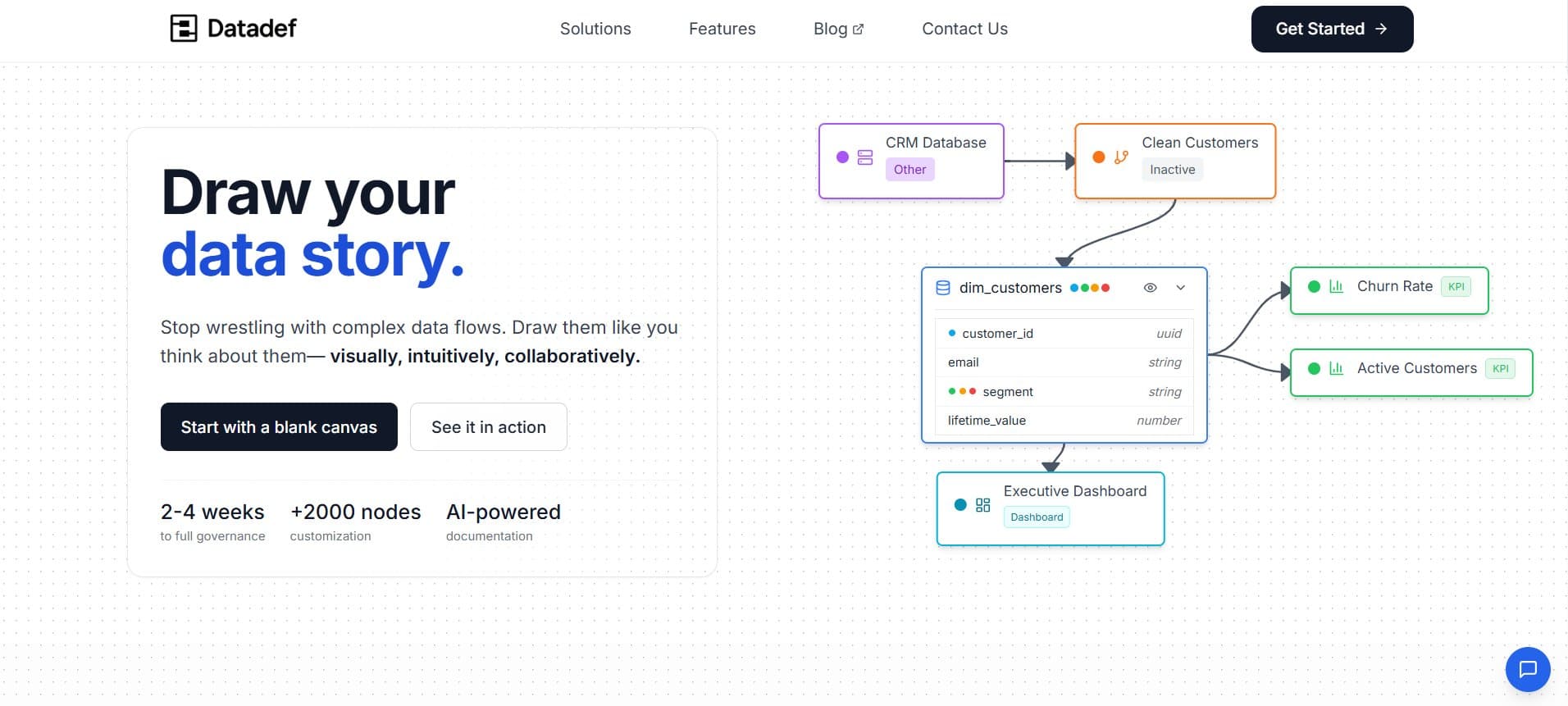
I use Datadef.io for this, though the tool matters less than the habit. The diagram I've been implicitly describing throughout this article — SCADA and PLC sources, cleaning and validation, factory enrichment, production dashboards and maintenance reports — I drew it before I wrote a single line of Spark. And I caught three significant design issues just by looking at the picture.
The diagram also becomes the onboarding artifact. When new team members join, I don't hand them thousands of lines of code. I show them the picture. "Data flows from left to right. These are our sources, these are their quirks. This is where cleaning happens. This is where we detect anomalies. These are the outputs and who consumes them." Ten minutes, and they have a mental model that makes everything else easier to understand.
Factory floor data is unforgiving. The sensors are unreliable, the volumes are massive, the latency requirements are real, and the cost of errors is measured in broken equipment and production downtime. I've learned to build systems that are simple enough to debug at 5 AM, flexible enough to preserve the signals I might not recognize as important yet, and explicit enough that I can explain every transformation to a skeptical plant manager.
Draw first. Build simple. Debug fast. The rest follows.
T.L